Photography

DESCRIPTION
By using photography and design skills, create a project that encompasses a consistent color scheme from the image.
PROCESS
(Programs, Tools, Skills, FOCUS principles)
The steps that I followed in my process were:
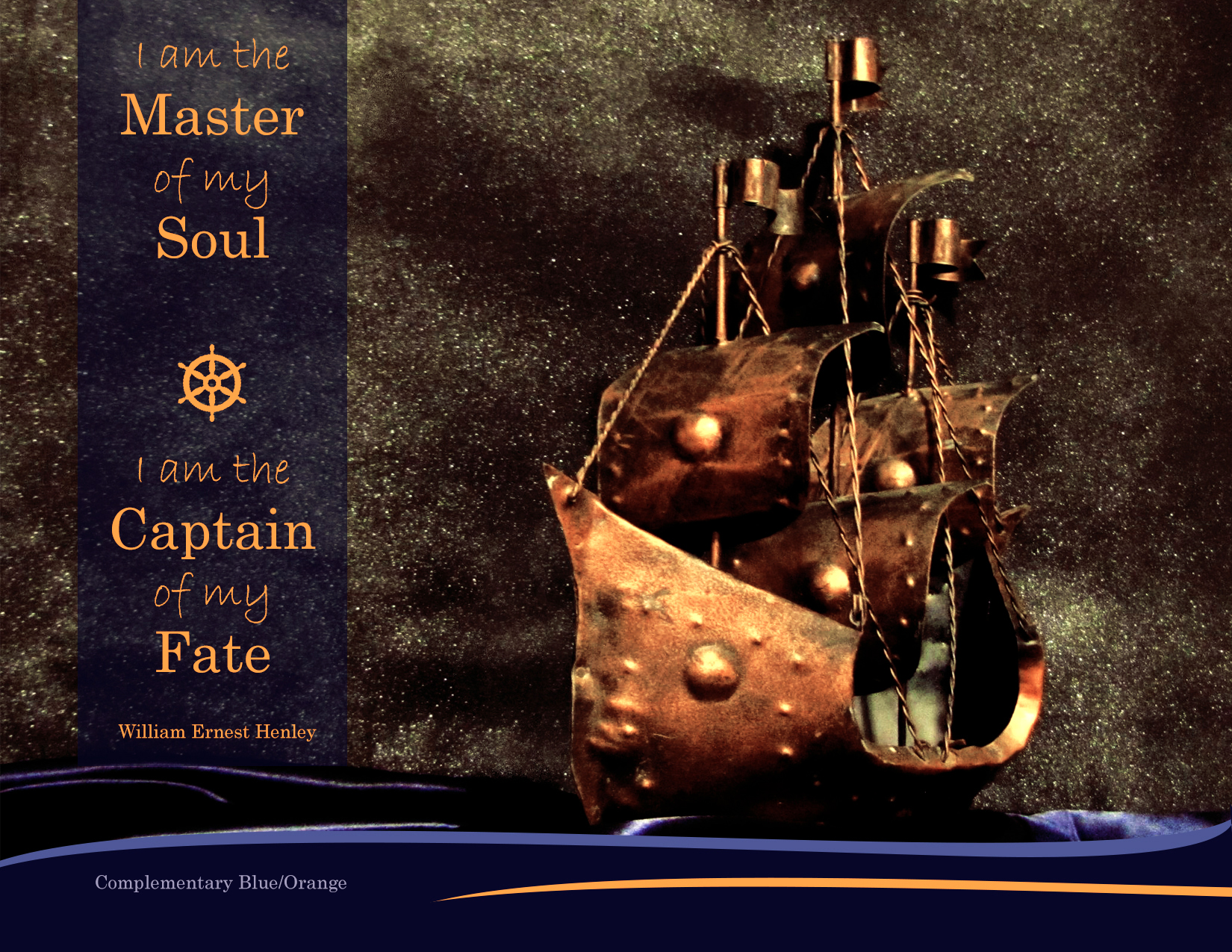
1. I decided my color scheme would be complementary Blue/Orange or Split Complimentary depending on which photo turned out better (Night ship or Sunrise).
2. I started with my Ship photo and thought if I couldn’t get it to work than I would jump to my sunrise. Once I adjusted the levels, vibrancy, and selective color I was amazed how much the fabric I used around the ship looked the way in does in person.
3. I created a new 8.5 x 11 inch document in Photoshop. Then I pulled my photo on top of it and started designing.
4. I didn’t want just straight lines or circles as a design element but something that added to the theme. I played around with flourishes, swirls and curvy lines. I did also add a helm element in the text to play into the theme and repeat the circle shapes in the ship.
5. The text was tricky with the star light background. I tried dark on light, no box, and stayed with my original but brightened and enlarged.
MESSAGE
We each are individually in charge of our life and responsible for our fate.
AUDIENCE
I think this would apply to a young adult audience taking charge of their life and older adults as well.
TOP THING LEARNED
I really appreciated some of the adjustments I could play with in Photoshop. I overall learned more just from the practice of playing with images, adding shapes, and applying text.
COLOR SCHEME & COLOR NAMES
Complementary // Orange & Blue
TITLE FONT NAME & CATEGORY
Century // Oldstyle
COPY FONT NAME & CATEGORY
Bradley Hand ITC// Script
THUMBNAILS OF ANY ORIGINAL, UNEDITED IMAGE(S) USED IN THE PROJECT


