Promotion
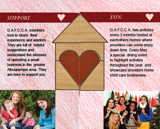
DESCRIPTION
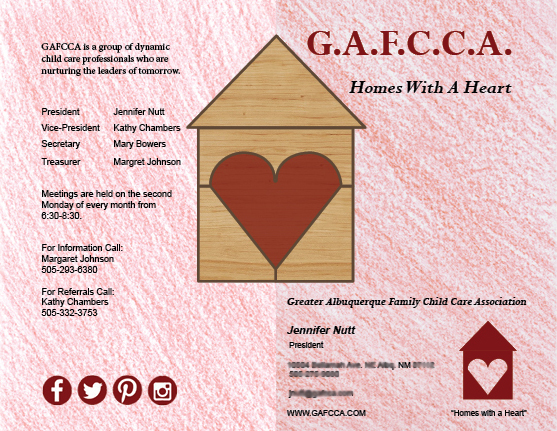
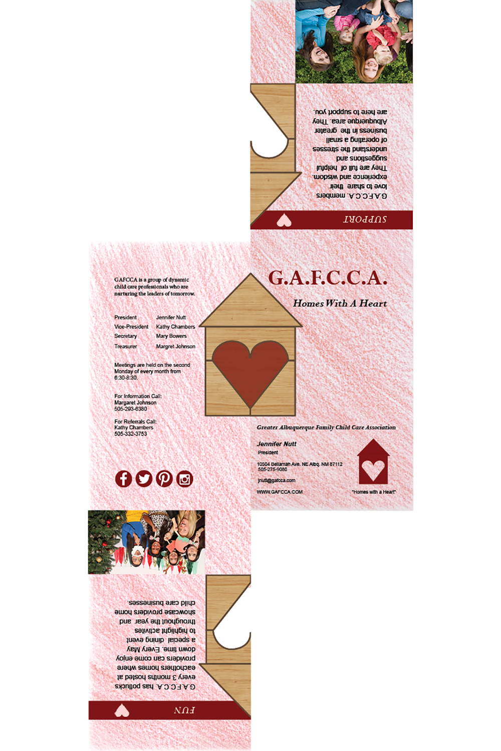
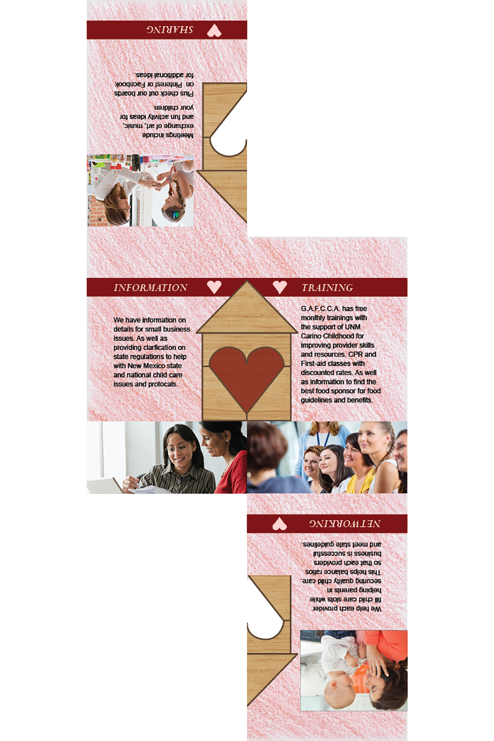
Design a brochure for a company.
PROCESS
(Programs, Tools, Skills, FOCUS principles)
The steps that I followed in my process were:
1. I first created the logo in Illustrator. It is similar to the business logo they already have but a little more versatile I hope now. I wanted to add a child’s building block to it and created a black and white line drawing, as well as a solid red logo.
2. Then I went into InDesign and started to design my brochure. I wrote my body copy from material found online on their Facebook and website.
3. I spent hours online trying to find appropriate pictures for the content that would also correlate together. It was hard to find pictures for child care that focus on the adults and not on the children.
4. I then exported the brochure document as JPEGS and PDF.
CRITIQUE PROCESS
I had critiques from Brad Campbell and Miranda Duncan. They both suggested adding more hearts to the design. The teacher also suggested a different background. I also had input from Daniel Cushman to make the bottom corner like a business card that could come off and be kept.
MESSAGE
To provide home child care centers with support and services.
AUDIENCE
Small business owners (providers) of home child care centers.
TOP THING LEARNED
Takes several print outs to get the alignment right. It can get expensive.
COLOR SCHEME & COLOR NAMES
Anaglous // Red, Brick, Orange
TITLE FONT NAME & CATEGORY
Perpetua // Serif
COPY FONT NAME & CATEGORY
Arial // Sans Serif
THUMBNAILS OF ANY ORIGINAL, UNEDITED IMAGE(S) USED IN THE PROJECT
SOURCE OF EACH IMAGE (website name and hyperlink)


