UI/UX APP DESIGN


DESCRIPTION
Redesign the website for Loup County, Nebraska. You’ll need to ensure that busy citizens who visit your site can easily find specific information, and that the typography you employ is both easy to read and pleasing.
Your site is information-dense and therefore will use a lot of type, along with images, skillfully arranged to present information in a clear and brief manner.
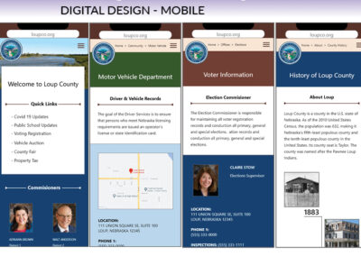
You are designing a mobile-first website. You will also design all pages as they’ll display on a desktop or laptop screen.
As you research and sketch, consider how you will use type size, placement, color, etc. to draw the viewer in. Gather as much research as you can on your topic, review similar sites, and begin your sketches.
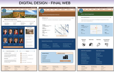
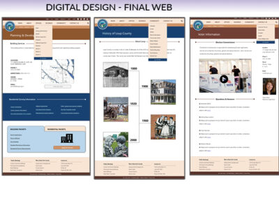
Design all laptop screens at a width of 1280 pixels, and all mobile screens at a width of 480 pixels. While screen widths and resolutions vary widely, these basic widths will help you understand how mobile-first, responsive design works. Include the following five pages in your design for both mobile and desktop (total of 10 pages):
– The Loup County home page
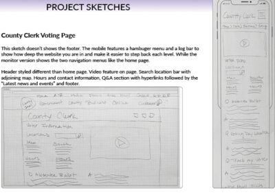
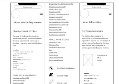
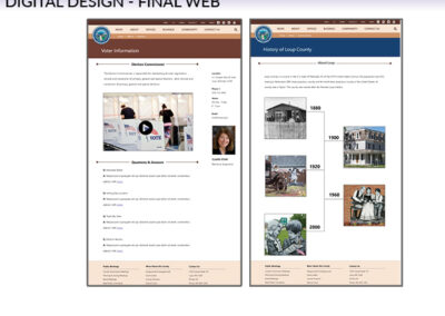
– A voter information page (helps users learn where their voting precinct is located).
– A drivers test page (showing the hours, place for written drivers test, & required documents).
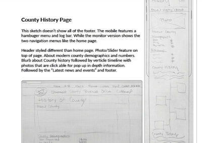
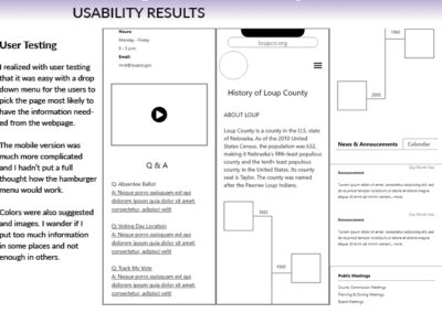
– A photo history page (showing a photo history of the county)
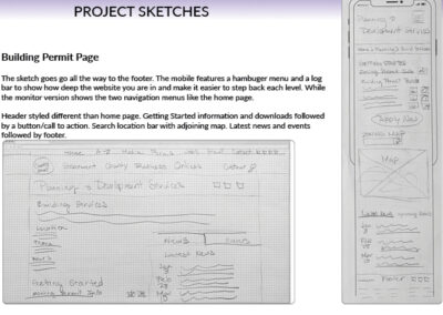
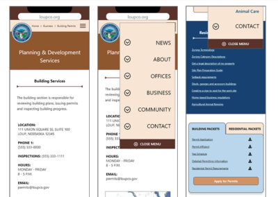
– A building permit page (where county residents can apply for a building permit, see a county zoning map, and download information and permits).
PROCESS
This project has less personalization since we are taking information about something that already exists and just updating it. Even though the original county website is very outdated it was hard to find real information about the county to build something that in my mind needed to feel bigger. Realistically this site didn’t need more than it had. I took the project from the stand point that the county had grown and needed more.
The steps that I followed in my process were:
1. Brainstorm ideas and research existing apps and compare pros and cons.
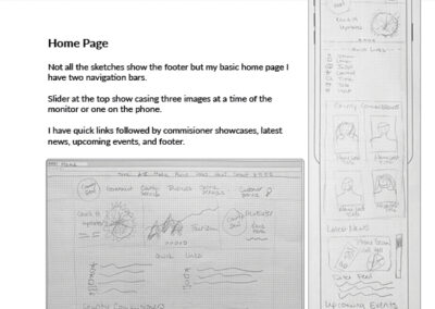
2. Make a list of scenarios and sketch sitemap and main pages.
3. Find a few users to help with testing and make 3 personas to help tell the app story.
4. Design logo, choose typography and color scheme.
5. Paper prototypes and user testing.
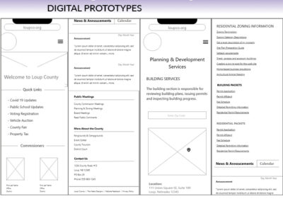
6. First digital drafts, wire frames and user testing.
7. Second iteration and more user testing.
8. Add color and last set of user testing.
9. Final iteration
User Testing
I meant to add a history bar at the top of each page to show how they got to the page they are currently on. I think this would help with navigation.
One user mentioned that I should have a welcoming message on the home page for the web view like I do on the mobile view.
Another user mentioned that I didn’t have many call to actions.
It was also mentioned that the mobile version lacked social media. I am not sure where I would or should place it. On the web page is is on the top but maybe on the mobile it would be better on the top since the navigation bar is positioned into the hamburger menu.
For the voter information page I was wondering from a coding background if I had laid out the boxes or sections in the correct order on the mobile version.
The history timeline images may need to be increased depending on the photos used. The voter page I wander if I should have more Q & A than just three which is what fit in the similar size as the other pages.
CONCLUSION
These projects in Interaction Design class have so far really made me practice more in areas I have had yet had time to.
To portray information with design that isn’t overwhelming and yet also user friendly has been an interesting niche.
Knowing your target audience has been key and realizing the limits to prototype that you build and been all consuming to my patience.
I prefer to use the computer for any long term work on the computer and only utilize my phone when out and about or if I just need a quick answer.
After much user testing I realize the more people everyday just utilize their mobile more and more and rarely have a actual computer in their home.
I also noticed that if I wanted to innovative and set new “normals” that this would alone be a time consuming part of the work. I realized through my research that I just found a few favorites in layouts already accomplished and just mixed and matched those together to achieve my compilations.
I would like to not just take others work and shake it up a little but also add to what is available always improving to it.
Something to keep in mind.


