Promotion
DESCRIPTION
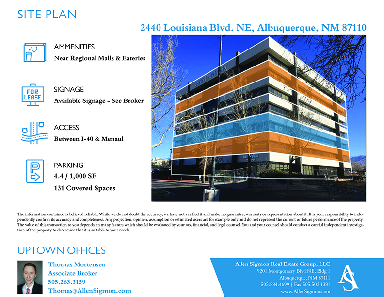
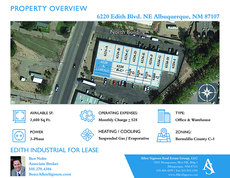
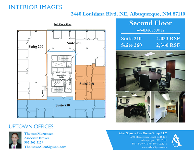
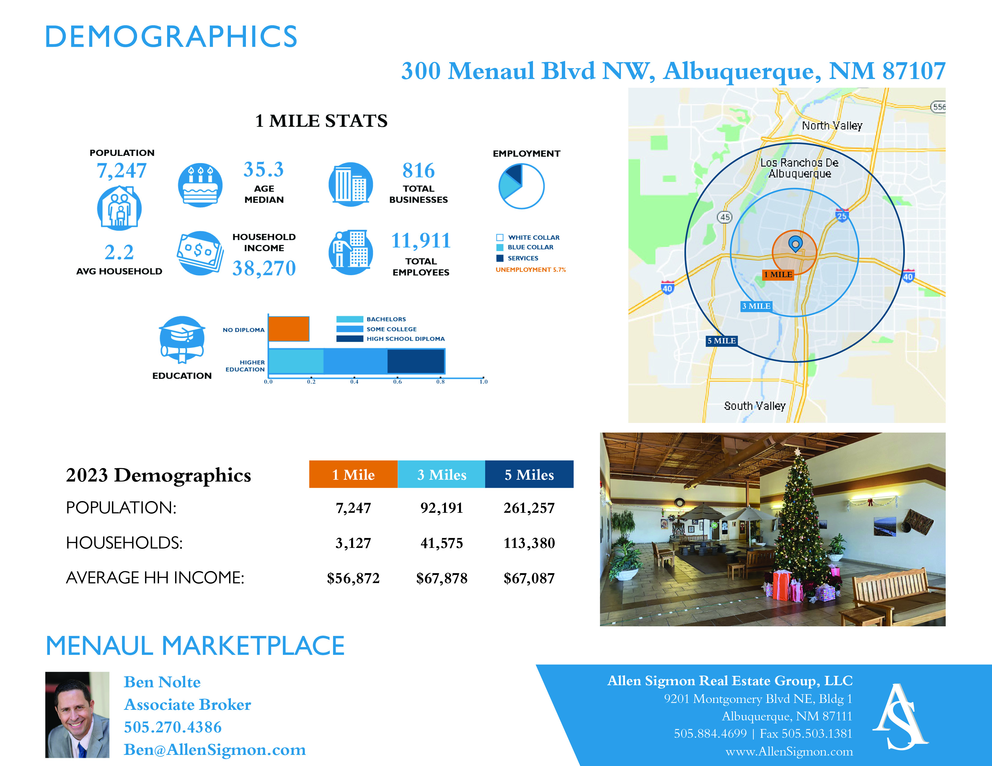
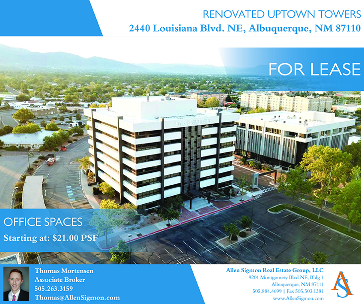
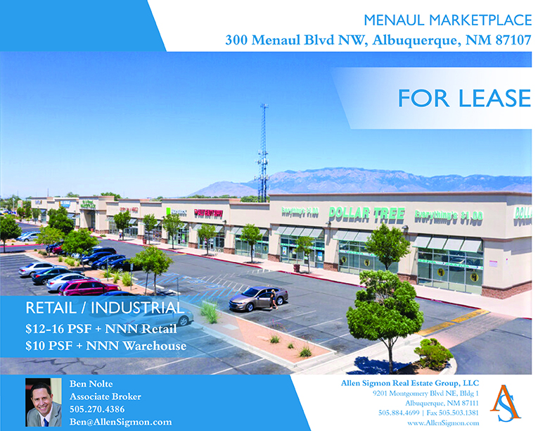
Local commercial real estate group needed an updated template that the details for each property could be plugged into. Each property has quite a few differences and specifics or highlights that need to be optimized without being too heavy on text.
PROCESS
(Programs, Tools, Skills, FOCUS principles)
The steps that I followed in my process were:
1. Learn
Each property has unique attributes whether is was pricing and contracting or layout and features. Specific brokers handle each property before it is handed over to a property manager. Each broker has preferences in regards to marketing their properties but the branding needs to stay consistent under the real estate group.
2. Research
After looking at other competitors flyers, getting input from the brokers about what they liked or disliked, I could build a flyer template and tweak as necessary for each property. Assets for each location at first was very disorganized and scattered throughout multiple files or even devices.
3. Build
Some locations had drone shots, some interior images, some floor and/or site plans but many needed to be updated or built. The flyer template was originally built in InDesign utilizing Illustrator for Icons and Photoshop to adjust images. Properties were organized into folders so that Adobe could correctly locate all assets. The flyer was eventually set up in Canva too so that Marketing reps could adjust basics without knowledge of Adobe programs.
MESSAGE
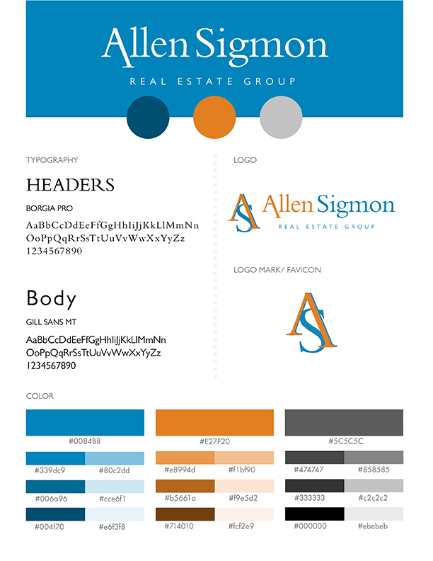
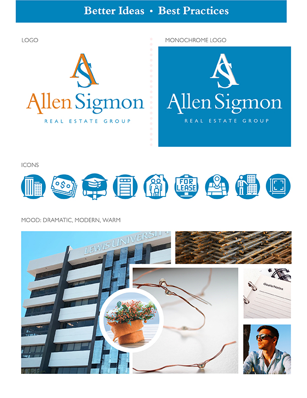
Branding was similar to assets scattered and all over the place. This can make it difficult to update or create new multimedia. A similar process was followed to help focus the branding for future products. Typography was found and corrected in some areas. Colors were fine tuned and specific variation of the logo settled. Their message is “Better Ideas ~ Best Practices” always looking to the future for innovation and concise action.
AUDIENCE
My audience was at first the owners and brokers but in reality affects the investors, and small businesses that utilize the properties. I think that is what becomes so overlooked in branding the audience is always much larger.
TOP THING LEARNED
I learned that I need to communicate that when building a template of any kind it takes a little longer than once an established template is finished.
I learned that once a broker asked me for an updated flyer that I needed to know the deadline that they needed it by so that I could plan appropriately. By the end of organizing the files for the 32 active properties and archiving 268 properties. I understood better what was needed at each site and could easily drag drop or crop to have a professional print quality product ready within the hour.
I learned that in Adobe programs over time color codes slip and this can cause an issue with print quality. After researching it some the problem had been already notated and not yet updated in recent releases but I will be keeping an eye on this as I move forward.
